Friday, April 27, 2007

Image Essay # 15


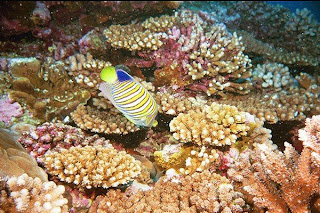
So far all of the pictures that I have made comments about have been either still lives or a painting or a portrait of something. I chose this picture because it was different from all the rest. This picture was obviously taken underwater. Most times people think that underwater scenes are very dark and have no character. This isn't the case in this picture. In this picture I noticed two different color schemes. The first one I noticed was on the fish, blue and yellow. Blue and yellow are not necessarily considered to be complimentary but many people mistake this. Blue's compliment is in fact orange. As I was looking at this piece and was trying to figure out why blue and yellow look so well together. Maybe it is because both colors are so chromatic, and seem very vibrant when placed next to each other? Or maybe its because it is how they are juxtaposed next to each other. I was then thinking if the fish had a different hue of blue next to the very vibrant chroma of yellow, if the fish would still be appealing to look at. Right now my eye is drawn to both of the very vibrant colors.

The next color scheme that i thought I thought I could pick out was analogous. The red, yellow, and orange in the choral are very muted tones. For instance the red choral looks as if it is a very deep purple, or almost a mauve color. The yellow is still very yellow but not as chromatic as the yellow in the fish. And as for the orange it seems to almost be a peach color. Again I liked reviewing this piece because I thought it was very interesting to see that we can find these colors under the sea.

Thursday, April 26, 2007

Image Essay # 14


Recently in class we have been talking about science movies. The reason I chose this movie poster is because it has a lot of the elements that we have been talking about in class over the course of the semester. One of the very first things we talked about in class what the triangle of hierarchy. In this poster you see the two people at the bottom almost head to head. In between those to men there is another man, possibly lower in power than the both of them, or maybe he is a middle man, used by both other characters.
The second thing that I noticed was the color scheme. I think the color scheme is analogous because it uses different shades of blue. The hues of blue that are used make you think you are underwater. Also, I think the hues of blue make the poster look like sci-fie because the blue green color that is used reminds me of a color you would see if a test tube in a science lab. I also like how the submarine is upside down and appears to be sinking. The people at the bottom of the poster seem to be trapped in a circle of darkness, I do not know if that is supposed to be cliche, or if that is just how the artist juxtaposed the movie poster. I also like this poster because is has ambiguity, and it makes you want to watch the movie and figure out what happens to these people and why the submarine is sinking.

Image Essay # 13


This is a painting my Gabhan O'Keeffe, an interior designer. There are many things I like about this picture of a dining area. The first thing I noticed were all of the colors. It seems to me that the color scheme is analogous, or three colors that are close to each other on the color wheel. The three colors that make up this analogous color scheme are red, yellow and orange. The red hue I feel is the most dominant. Even though red is used as an accent color, it really makes a statement. Red is also used on the back wall, as over sized vases. The color red also used to bring in drama into the room. By using such a bold hue of red is risky but makes the room dramatic. When red fabric is used on furniture, especially chairs, it gives the person who is sitting in it a sense of royalty.
I also think that the orange color that is used on the carpet sets as a good background to the rest of the room. I think that the orange carpet also warms up the space and makes everything feel warm. The other color that adds interest to the room is the hue yellow. The yellow in the red vases really makes the back wall pop. By using all of these combinations of texture gives the space life. By life I mean a feeling that it is a lively environment, where people gather to eat and talk about past times.

Thursday, April 12, 2007

Image essay # 12


This picutre was drawn by the artist Eric Fischl. Most of this artists' work are becoming of age stories. This picture is of a man and a woman in the bedroom with little or no clothes on or even appearing to be getting dressed. When I looked at this picture many things ran threw my mind. At first it just looks like a nornal every day picture, like one you would shoot from a camera. Then as I was doing some background on this painting I found that this painting was part of a series. The was the third painting and was called Bedroom Scene #3 . This series of work was showing the "fantasy" of two people becoming intimate with each other. Each painting showed a different scene, and by looking at each picture by it self it let the imagination fill in the gaps as to what was going on, but with the pictures all together, the viewer could put together the entire story.
I also noticed that in this painting there was a complimentary color scheme going on; with the red and green. I thought it was very surprising and risky to but such chromatic colors in the background. Usually colors that bold are placed in the foreground wanting to jump off the page. Also, the white is very vibrant in this picture and I feel it adds a lot of depth to the painting. It looks like the bright early morning sunshine, or even the bring moonlight is coming through the window illuminating the back of the painting. I like this risk and I think it works very well!

Wednesday, April 11, 2007

Image Essay # 11


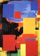
This is a painting by Hans Hoffman. In class we briefly talked about this artist, and after I saw a few of his works I wanted to look at more. This picture caught my eye for a few reasons. The first reason this painting caught my eye was because of the very bright colors, the very chromatic blues and reds. Some of the colors seem to want to jump off the page and hit you in the face. Also the colors blue, red and yellow create a triadic color scheme, which means these three colors are equidistant from each other on the color wheel. Also in this painting I liked how some of the colors seemed to pop out and yet other colors seems to recess and fall back. This is because the very bright chromatic colors pop out of the page. The more dull colors such as the pale blues and the pale yellows seem to recess and not have as much of an impact as the more vibrant colors. Because some colors are more vibrant than others it gives a great amount of depth to the painting. If all of the colors were the same vibrancy then the painting would look very flat and not have much dimension to it at all. This is a very exciting painting to look at because of these bright colors and the way they are juxtaposed on the page. Also, all colors look different when they are placed next to other colors. I was trying to imagine what this painting would look like if the red block of paint were juxtaposed against different colors.

Image Essay # 10


This is a paining done by Lucian Freud. As I was looking through other pieces of his art work I noticed that he mostly paints people. Also, in most of his works the people that he paints are usually naked and are positioned in what would seem like an uncomfortable position. This painting are also painted uses very bland colors, such as brown and burnt oranges, giving the picture a feeling of disgust or something unpleasant to look at. When I came across this piece I was a little surprised. First of all the man in this picture is wearing clothing and was not positioned in an uncomfortable position. The second thing that caught my attention was the colors that were used in this painting. Freud uses varying shades and tints of blue, this gives the painting depth. Another feature in this painting that also grabbed my attention was that the face did not seem to be in pain. Although, in this painting the mans face looks depressed, he does not look like he is in pain. I also like this picture because the person seems to show affection towards the dog, also showing something different that his other works.
I picked this painting because when we were looking at his works in class I did not fully understand the concept of his paintings. As I looked through more and more painting on my own time I began to see a "trend" in his art work and this painting seemed to me that it went "against the grain".